CLOSE
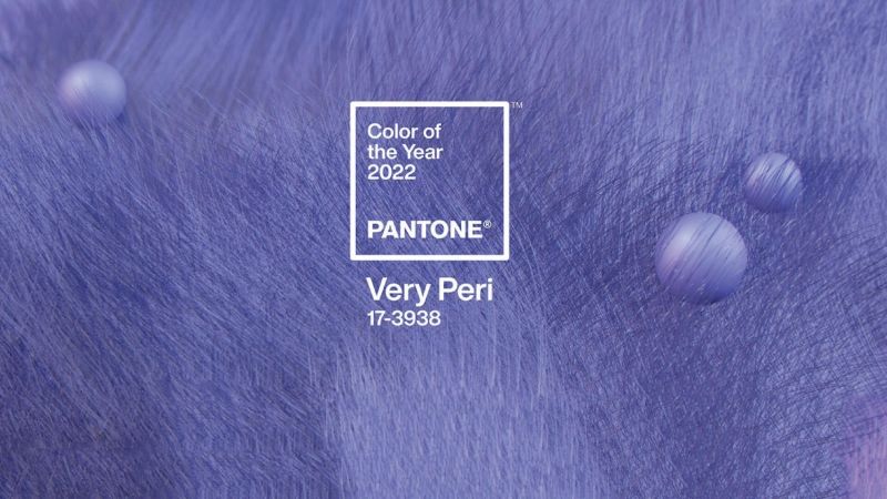
CLOSEVery Peri - How To Use This Pantone Color In Your Home
Eager fans of the design world and color lovers, in general, will already certainly know which is Pantone"s choice that will shine in 2022. Very Peri is a shade of violet, that intends to symbolize the transformational era in which we live due to the pandemic. But that"s not all. Very Peri also wants to stimulate creativity and mark the beginning of a new age. Pantone decided to create a completely new tone, which combines the �constant tranquility of blue with the energetic infusion of red�.
This is the first time the graphic company has created a new shade rather than selecting an existing one from its color palette: �Creating a new color for the first time in the history of our Pantone Color of the Year educational color program reflects the global innovation and transformation taking place,� said Laurie Pressman, Vice President of the Pantone Color Institute.
But the real question is: How to use this color in your interior design? This is where Zagas comes in, with some tips on how to incorporate this modern tone into your home design!
COMBINATION IS KEY
This new hybrid of blue, red, and purple has the merit of being able to perfectly combine with a wide range of shades.
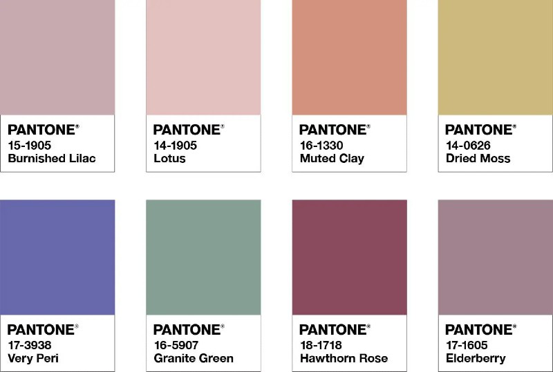
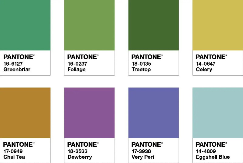
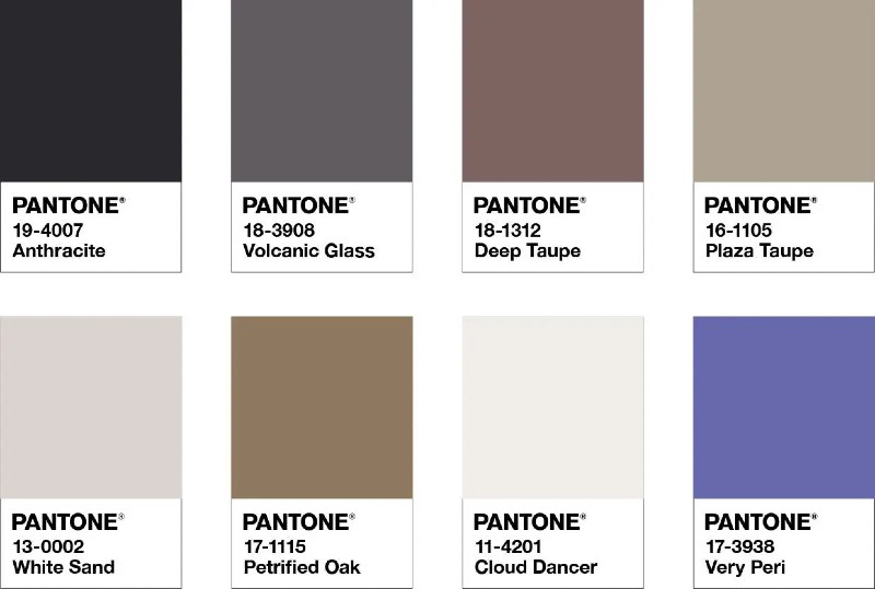
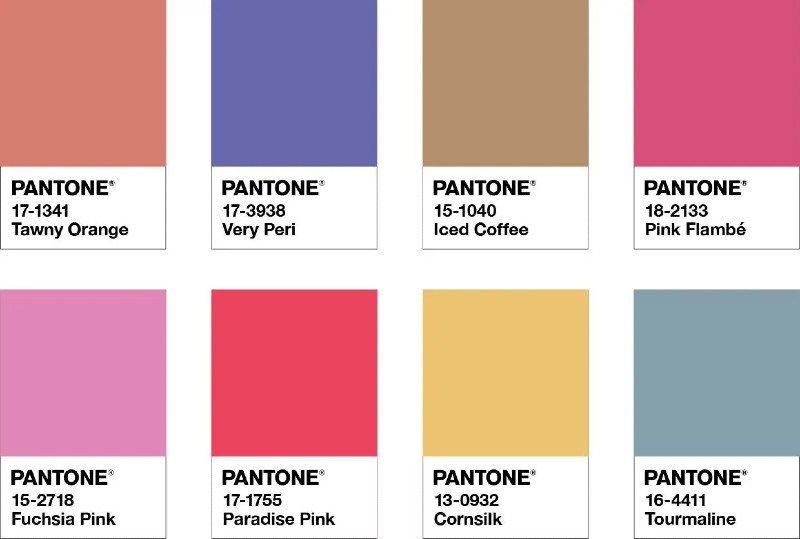
To help you make the right choice, Pantone has developed four different color palettes. The first is the Balancing Act and includes Burnished Lilac, Lotus, Elderberry, and Granite Green; the second is called Wellspring and is inspired by nature with shades such as Chai Tea, Treetop, Foliage, or Eggshell Blue. The third palette is The Star of the Show, a sophisticated selection of Taupe, Volcanic Glass, or White Sand. Finally, the last palette is called Amusements and it is the most cheerful and fun. With its Pink Flambé, Iced Coffee, Tourmaline, and Tawny Orange, it"s perfect for those who aren"t afraid to be daring.
See the complete palettes below!
BALANCING ACT
WELLSPRING
THE STAR OF THE SHOW
AMUSEMENTS
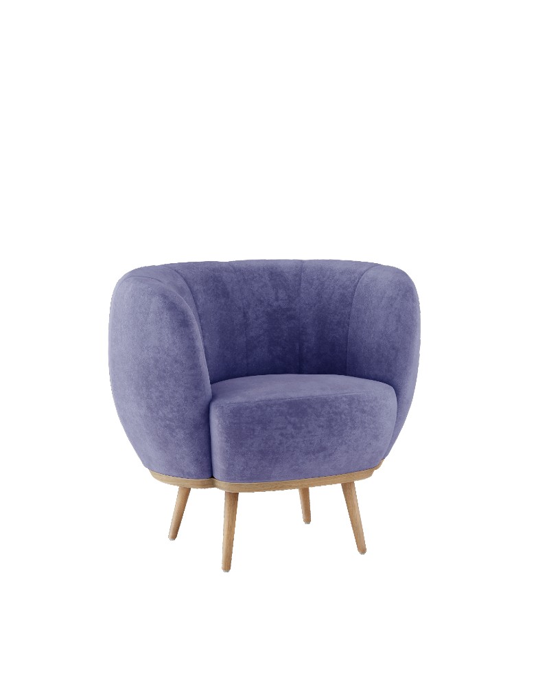
A FEATURED PIECE
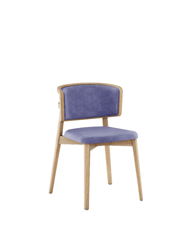
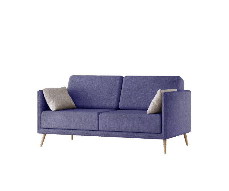
Very Peri fits well in a variety of decor styles: from Industrial to Scandinavian or even Shabby Chic to Japandi. All you have to do is use it smartly, our tip is to focus on a single piece of decor, capable of capturing attention and changing the look of living rooms, bedrooms, and kitchens.
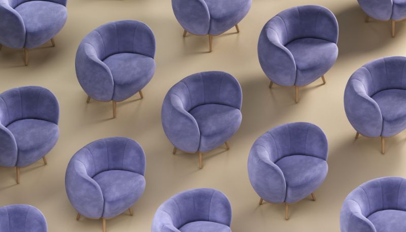
So, instead of opting for the classic neutral tones or colors that are now common, such as green and pink, why not add one of our Cloud Armchairs, an Alice Dining Chair, or a Valentine Sofa in a Very Peri shade, to your interior decor?
GET THE LOOK
THE MORE THE MERRIER
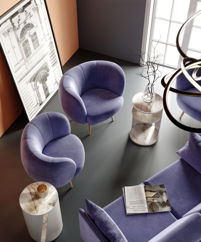
The Color of the Year chosen by Pantone is Very Peri, but this choice paves the way for a whole series of shades between purple and periwinkle blue. If you"re looking for a wow effect and aren"t afraid to be bold in your decor ideas, then why not play by layering different shades of the same color?
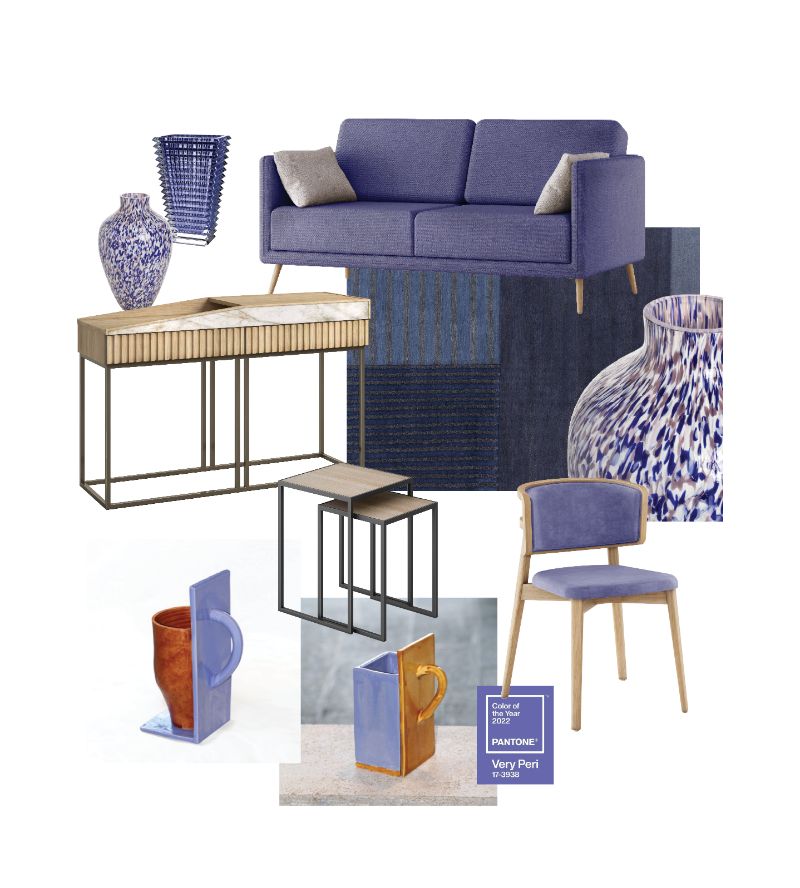
This Zagas moodboard offers several ideas on how to create captivating environments using furniture, pillows, and other small decorative objects, starting with dark purple, passing by Very Peri, and landing on lilac or wisteria.
GET THE LOOK